Sunday 11 May 2014

Final Animation

Here I will explain some of the processes involved in actually making my final animation, followed by the animation itself at the end of the post. Firstly I will say that the prep work is not included in this post and it is more about the progression of render tests and animation choices, to see how the environments were made simply look further back in the blog. The biggest challenge for creating the animation was making it flow in the way I wanted, which was for the eye to lead straight to the canyon, which lead to the clouds, which lead to the ice planet, and so on.

There are two problems with this, the first is that the files ended up quite large and hard to manage, the second is the render times are completely ridiculous. To deal with the first problem animation files were kept seperate except for the canyon to ice cave scene which had to be part of the same animation to blend correctly. To deal with the second problem rather than rendering the animations out to AVI files they were rendered as PNG sequences, this allowed for faster render times with no consequence if the computer turned itself off or something like that, it can also useful for compositing to have stills of the first and last frame of each animation.

Because the canyon and ice cave scene were both seperate I had to merge the files, I then set up a new camera, and started re-arranging all the keyframes that were already in each scene. I then thought about the feedback I had recieved in focus groups and started creating test renders. Here is the first below.


In this render I had simply put the pieces together, and roughly created the transition between environments, the cubes were for cloud placement because at this point I hadn't merged them with that file. I also tested the changing of the background colour in order to try an change the mood of the scene but this only really became effective at changing the mood when the colour of the lights were also changed along with the sky. The shattering of the sky although it wasn't what I had originally envisioned was the best way I could think of that would also represent that world shattering after the mountain is broken. The main problem with this scene was the brightness, altough it doesn't have ambient occlusion on but the ice planet was meant to get much darker as the camera approaches.


In the above scene the main changes are the clouds were added and the lights and materials of some objects has much smoother animation that was much closer to what I had envisioned. The clouds turning dark before they explode was interesting because it was actually just the way the material was picking up the area light from the canyon but I quite liked it so left it in. The clouds are supposed to become less interesting and then dissipate so them turning a greyer darker colour does make them seem less appealing and then they explode. If I had time I would have liked to make the whole cloud scene longer maybe have the camera fly through clouds for about 20 seconds, but unfortuneately I didn't have the best time management nearing the end and was only able to render what I felt was a priority, including re-renders of all the other scenes.

Below is the final Animation although I will be working on a longer version in order to create a music video but hopefully the piece demonstrates how light, colour, movement and form all communicate emotion in experimental animation. Although the piece has undergone many changes, and the project as a whole was a fairly bumpy road, I am happy with the final piece, as stupid as it sounds I feel that it is one of the purest things I have ever created and is very close to what I had envisioned. If I had more time I would have liked to add more synaesthesic elements that would visualise the music, I would have also liked for some of the scenes longer, but as it stands I think the amount of time it takes is well suited for the degree show as people won't want to stand in the one place for five minutes watching my animation.


Thursday 1 May 2014

Quick Look at some other experimental animations

Erään hyönteisen tuho (The Death of an Insect)

First thoughts: The most striking quality about this short film is the movement, although the detail in the models and the huge variation of lighting adds greatly to the piece but the movement is what creates this sort of pure beauty from what many people would consider to be disgusting things, the film seems to relate the insects and their movements to aspects of human life, to begin with it seemed like despair, falling and things falling apart, it then started to turn to destruction and as soon as the light to dark horizon shows up and the sun moves rapidly to the right the insects begin marching and almost look like they have guns. By the end of the film the insects are incorporated with our real world and have created complex ethereal machines that float above our cities.

The overarching theme seems to be humanities disrespect for all forms of life and our preference to destroy rather than create, much of the piece feels very dramatic, and is lit in such a way that seems to suggest its not about how good we are. Our ability to despair, destroy things, wage war, and create things all come across over the course of the video and all of them take part on a never ending cycle a rhytm of life that is much the same as an insect spiralling towards the ground or the DNA within us as humans.


Hooray For Earth - 'True Loves' (Cereal Spiller Remix) Directed by Cyriak

The most striking thing in this animation is the timing, and through the composition the camera simply zooms in the entire time but speeds up and slows down at certain points, the movement is also largely quite uniform along isometric tangents and its through this compositional clarity that gives the music video its visual appeal


Wednesday 30 April 2014

Stage 5: Flower City

 This is the final part of the animation it will include a city within a flower and a light that descends into the flower, the flower will then open and the camera will move into the city and towards the light, this represents hope and opportunity, and the city with its tall towers supported by each other is representative of the people within the city that support each other.

Below is some images of the development of the piece and then a preview animation, though the final animation will take place in a similar environment to the heaven one in a post below.

First of all I made some basic cuboids of different sizes and did at least 3 alterations of each and arranged them so that no two were that close together. I then further duplicated and rescaled these buildings and combined them with each other to create further variation.
 
I then imported the buildings into Cinema4D and started texturing them, in hindsight it would have been better to import all the basic pieces into Cinema4D before arranging them into a city so I spent a little bit of extra time replacing untextured buildings with textured ones.

I added the flower to the scene and animated it, then duplicated and rotated and scaled the city a couple of times and created a much denser looking city.


Monday 14 April 2014

Heaven and Hell

For my new team "squelch animation (wip)" I am creating some work for a showreel but I am also going to use variants of the scenes in my final animation to replace the space element scene which I decided against. Below is a progression of both scenes.

Hell
 I used a boolean to cut a landscape out of a cube

 I then created several mountains that had a 360 degree bend so they went round in a tube to give interesting effects.

 I then duplicated the mountains and rotated them and moved them further back

 I added a blueish and red light, I liked the dark blue on the rocks but not so much the red.

 I changed the redlight to a volumetric orange light I felt this worked quite well.

I added a black spiky orb I'd modelled to act like a sort of pupil and changed the blue light into a volumetric one and added a pretty intense glow to the background, I do like this render but it wasn't right for the scene.

 I was quite happy with the lighting in this scene and decided to continue working on other elements in the scene

I tested a fresnel displacer on the orb as in my experience this can create quite interesting effects when combined with complex geometric objects.

 I then applied a gradient displacer to the orb and changed how it was mapped to get a more randomised dispersed effect.

 I then added another lower intensity volumetric blue light, and added a camera, I then animated the camera and the eye.
Here is the video of the animated environment. which should loop once composited in the showreel animation.


Heaven

 Initially I tried to make a beautiful natural fertile looking landscape.

 I then added clouds and some lights but quickly realised the materials and lighting would need alot of work. I created the clouds by duplicating spherical landscapes under a connect and rotating and scaling them.

 I thought one large light in the center would be quite effective, I tried some variations of fog textures of the clouds but was not happy with the effect.

I duplicated the clouds and added another pinkish light in the foreground to lighten the scene making it seem less sinister.

 I finally got a material I liked on the clouds, just a slightly transparent matte material.

 I then filled up alot of the gaps with clouds, and added visible spotlights to try and create a more heavenly light.

 a close up of clouds, I think I was testing the visibility of a spotlight.

 I decided I liked the water better as space.

 I then tried out a highly reflective surface.


and then settled on something inbetween. I then started animating the clouds and lights and it is currently rendering a preview.


here are some renders I messed about with in photoshop.


Thursday 3 April 2014

The History of Motion Graphics and Definition of Terms

The History of Motion Graphics: From Avante-Garde To Industry in the United States
author: Michael Betancourt

page 11

"Contemporary 'motion graphics' first emerged from experiments with kinetic abstraction in the late nineteenth and early twentieth centuries. The nexus of abstract film's synchronized geometries with live action outside the framework of narrative, the conventions of sychronized sound and image, and finally the development of kinetic typography shows that motion graphics are more than animated graphic designs."

Some of the first motion graphics consisted of abstract films created in 1909 by Futurist painters, these experiments were unfortunately lost, however they did not simply appear they were established from a larger context that produced abstract art generally. The core of the development of motion graphics was and is synaesthesia which is a term used to describe the visualisation of music and is most obviously demonstrarted in commercials, animated logos, and title sequences. "The aesthetic principles that organize and structure the relationship of image to soundtrack, originates with the earliest abstract films, and before them, with color music."

Page 12

"Prior to the 1980s, motion graphics were almost entirely limited to media made by artists. 'Synaesthesia,' as a term for connections between sound and image, is used in both psychology and art history:

   In psychology, where it identifies a specific perceptual phenomena where one sense simultaneously produces two sensations, most famous as seeing colors when one hears sound.

   In art criticism and art history, to define art works where (most often) visual forms are produced as an analogue to music: in synaesthetic abstraction, these connections are explicitly made by the artists in their work."

Page 40

The origins of motion graphics lie within abstract film which provided a foundation for the conventions of how images should interact with sound. By tracing developments of abstract motion pictures during the twentieth century three distinct phases can be identified that mark its place as a genre of animation. The first phase starts with the creation of motion pictures and "ends with Art in Cinema exhibitions organized by Frank Stauffacher at the San Francisco Museum of Art in 1946." This marked the beginning of the second phase characterised by the development and consolidation of organisations that are dedicated to presenting films as an art form, unrelated to Hollywood and commercial cinema. The third phase began in the 1970s with a historical focus, "the abstract film and video were institutionalized by the art world that selected canons of major artists in avant-garde film generally; abstraction based on synaesthetic concerns was relegated to a minor position within this history."

Page 79-82

Oskar Fischinger (1900-1967) is one of the artists most closely associated with motion graphic production, often taking a very direct approach of synchronizing note to form. Fischinger established a connection between sound and abstraction-in-motion after most of a decade spent experimenting with "automating and reducing the labor required to produce animations." One of the pieces that best demonstrates Fischinger's ability to create engaging and communicative pieces with basic shapes and the synchronization of note to form is An Optical Poem (1938), to create this complex series of shapes flying through space he constructed a scaffold and manipulated the shapes with wire. The piece is shown below.


Page 90

Len Lye and a collaborator Laura Riding wrote a paper "Film-making" in 1935 in which "Lye proposes a tentative framework to think about motion as form:

1. Form in movement-compositions is the total effect of accidental design created by cross-movements, perspective movements, timing, accenting - all the varieties of action whether in natural juxtaposition or not.

2. There is a possibility of isolating a movement-consciousness by reverting to such reflex-spontaneities as hereditary instincts are composed of. It might even be said, perhaps, that this gift of physical immediacy, which is the gift of a consciousness of movement, is discoverable through the brain in blood, organs, tissues, nerves: that a physical time-sense can be physiologically cultivated.

3. Consciousness of movement may be purely receptive, as a passive sensing of the vibration-pattern: so we might speak of a sense of movement just as we speak of a sense of telepathy, meaning a receptive intuition of other people's thoughts, or a theosophic sense, meaning a receptive intuition of things unknown."


Defining terms

Experimental Animation

Is typically non character based and does not include narrative but instead creates meaning through visuals and the movement of them, to truly experiment though requires the animator explores the unknown to attempt to create something that has not been done before. Experimental animation also often uses synaethesia in order to give music form.

Non-Objective Animation

Non-objective animation differs from traditional animation because it does not attempt to be representational of life and is more expressive creating forms and the movement associated with them that are purely imaginative.

Non-objective animation is without a doubt the purest and most difficult form of animation. Anyone can learn to 'muybridge' the illusion of representational life, but inventing interesting forms, shapes and colors, creating new, imaginative and expressive motions — 'the absolute creation: the true creation,' (1) as Fischinger termed it — requires the highest mental and spiritual faculties, as well as the most sensitive talents of hand.” William Moritz 1988


Wednesday 2 April 2014

tenth Supervisor meeting

My tenth supervisor meeting wasn't a particularly long one. I talked about how I'd started reading more about experimental animation and how my first focus group went. The main issue that arose was that I still need to properly define all the terms I am using, which is the highest priority right now and that is why I am still reading at the minute to better define what I mean by the terms I am using, I also need to get my first draft of my dissertation to Ken as soon as possible, this means I will largely be focusing on it this week. I also need to do my other focus group but I want to get my dissertation draft in first because it is worrying me the most and I will need Ken's feedback on it.

Wednesday 26 March 2014

Ninth supervisor meeting

At the meeting I talked mostly about my question being reworded and what that means, I explained that although the question has been reworded it has been done so in a way that incorporates more of my research than the previous question. Ken expressed once again his concerns that my changing of the question would be detrimental to my grade, but I'm inclined to disagree and continue research under the new question that I feel encompasses more of my research and is more relevant to my final piece and dissertation.

I reported my progress with the focus group hypothesis, and videos as well as my progress with my dissertation so far.

The agreed upon action points were to research more experimental/non-objective animations, which leads to the next action point of defining all the terminology and what it means to me in writing, I also really need to get a draft of the dissertation to him soon as time is running out.

Focus Group Questions and videos

Focus Group
Have they ever watched non-objective animations before?

What do they feel when viewing the piece? A feeling or a memory?
 
How is their emotional response affected by Colour, Movement, Lightness, Shape and which do they feel is the most communicative?

Which of the videos was most evocative and why?


(I have written my hypothesis for each piece but have not put it in this post incase someone from one of my focus groups sees it)

(videos still need alittle camera work in some places)

Stage 1: Introduction, going into the mind


Stage 2: The cracked canyon


 Stage 3: The Ice Planet

Tuesday 18 March 2014

Eighth Supervisor meeting

At my eighth supervisor meeting we discussed how the presentation went, and I showed Ken and the others in the group the videos I had made to show people in a focus group. Ken quized me briefly on what I was trying to make people feel and how I was going about it in the scene. I explained all of the things I had taken into consideration and the desired feeling that is meant to be created, though I need to write it all down I can't just keep saying it from my head.

Ken seemed a bit annoyed that I was going to change my question again but I explained that the project itself won't change, the question will just be altered to include more of what the project actually entails, after explaining this he seemed less concerned.

I also discussed the focus group and my idea of doing two and gauging the different responses, and even if they are unsuccessful it is fine because its all research, but in order to do my focus group I need to clarify the emotional response I expect and why, but of course during the focus group I will not let them know at all what emotional response I am trying to convey and will hopefully get mixed perceptions, it will also be interesting to see if other peoples perceptions can influence each other or if they talk about similar themes they may have in common. So far the people I have showed my work often give interesting and differing opinions on what the piece makes them feel but there are often certain elements that they have in common.

Crit Presentation Semester 2

Overall I think it was my most successful presentation yet despite some of the videos not being full rendered. The main problem as agreed upon by the lecturers was that my question does not quite explain the research and experimentation I have been doing, Ryan said that he really likes my project and he can see the project there but the question doesn't really cover everything because I'm not only using light and geometric forms to create emotions I'm also experimenting with colour, movement, composition, and representing forms in evocative ways.

Lynn really liked my more sporadic abstract works and thought it would be really interesting to apply that further within my animation and animation tests, all the lecturers responded really well to my use of abstraction which was very reassuring considering not so long ago I was very unsure of the value of it.

Brian was really enthusiastic about all of the work, most of all the ice planet scene, and he thought that the visuals were really expressive and he talked about how the visuals are clearly effective at creating emotion. I was really pleased to here his response to the visuals and again felt reassured that there was value to the work and that the emotional I'm trying to create is being created at least to an extent, but I am also really interested how people interpret the work and if it is evocative and makes the viewer think then like a song or painting it doesn't really matter what it's about aslong as there is value in it for the person percieving it.

Altogether I think the presentation went quite well and a lot of the feedback was very positive it has given me alot of confidence to continue working the way I'm working and has made me feel like there is more value to my work than I previously thought.

Tuesday 11 March 2014

Abstraction Distraction


I was feeling quite creatively stifled today and couldn't really work properly, I knew I need to do more animated experiments to show off the effects of light on geometric forms but I couldn't formulate my ideas properly. So in order to get the creative juices flowing I played about with some abstract pieces in Cinema 4D this time with a cleaner approach, this also allowed me to experiment with some pretty interesting visuals that could be used again in further tests or even the final animation. While creating the piece I didn't really have any goal in mind and allowed myself to be distracted easily and as the renders progressed so did the creative direction, I really enjoyed working in this way and it made a relieving change and left me in a better mood to continue working on animation tests and research.

Here are my favourite renders below:


Monday 10 March 2014

Tunnel


Here is a piece I have been working on as a side project but a lot of the animations used could perhaps be applied when travelling through the eye in my animation, it contains animated displacement, animated lights, and an animated twist.

Interestingly it is quite visually similar in certain ways to "Lapis" an experimental animation by James Whitney in 1966 shown below.

Saturday 8 March 2014

Recent Research

Shadows: The depiction of cast shadows in western art

This book made alot of interesting points about light largely how it is used or not used to convey a certain meaning or feeling within a scene, the author (E.H. Gombrich) talkes about the eye as an instrument "that depends almost exclusively on the modifications that the surrounding light undergoes when falling on the objects within view. The varieties of light and shade on their surfaces tell us of their shape, the reflections on that surface indicate its texture, and their reaction to the various wavelengths of the spectrum determine their colour." (page 10)

Throughout the book he describes methods of lighting or use of shadow in a great variation of pieces that are well known for using light well, some of the important examples referenced include Caravaggio "There is hardly a function of cast shadows that is not illustrated by Caravaggio's dramatic painting" (page 24) his dark style also known as tenebroso spread throughout italy and made its way further north until it culminated in the are of Rembrandt. Rembrandt has an extremely well lit piece 'The Adoration of the Shepherds' (1646) that illustrartes the holy story having the light from the holy child completely overpowering the light from a lamp, in this way he uses light to tell a story but also illustrates the intricate effects too different intensities of light can have on a scene. (page 51)

The book also has some insight into lighting within cubism and surrealism which in many ways is quite detached from lighting in the rest of western art, "Cubism reinstated the role of shadows both to guide and confuse the viewer. Later still the Surrealists exploited the effect of shadows to enhance the mood of mystery they sought" (page 26).


Plato: The Cave


In Plato's 'The Republic' there are many interesting concepts and ideas concerning form, number and light but the one in particular that I find most relevant to my work is the simile of the cave (page 316), The story is about three prisoners who have spent their whole existance imprisoned in a cave with their heads locked in position basically giving them a 2D perspective, and light illuminates the wall they are looking at, they can see people walking by as if on a road, but these people are not really people they are infact made of stone and wood but because they can only see the shadow and are unable to look at it from any other angle it is very real to them and becomes the whole truth.

Then one prisoner is freed and taken out of the cave, he does not at first believe what he sees and does not understand it, but eventually realises that it is much more than what he had seen before and he is happier because of it, but if he were to tell one of the remaing prisoners they would not believe or accept it and would possibly harm him for challenging all they know because he would be attempting to destroy their whole truth and replace it with something they are incapable of understanding without actually experiencing.

There are many possible interpretations of the Cave story but I was very interested in the difference between illusion and disbelief, along with the light representing an intelligible region and the difference between these two perspectives one being much more than the other.


Color: An Introduction to Practice and Principles

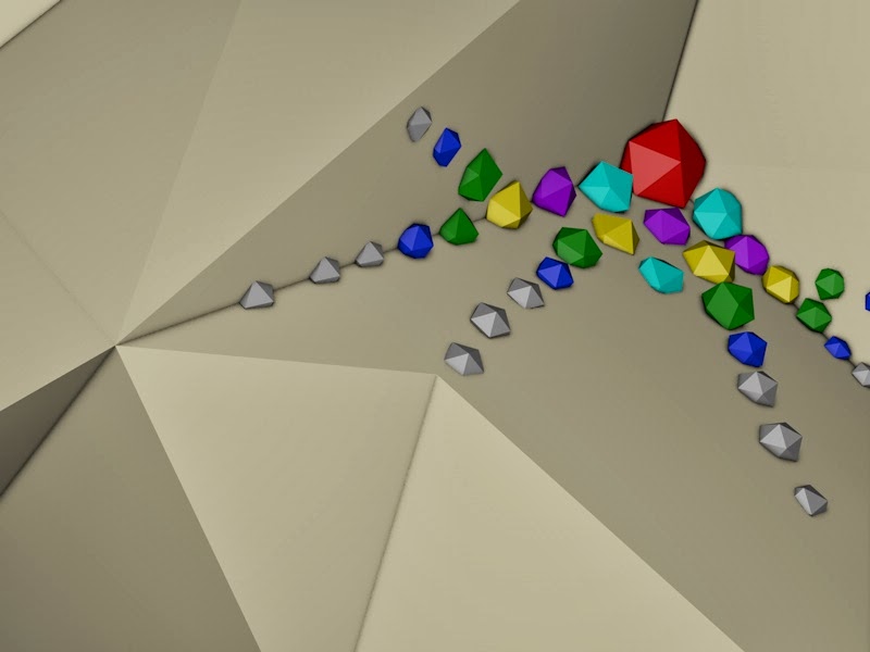
Although this book by Rolf G. Kuehni is titled colour there is a very large portion that is focused on light and it establishes the connection between light and colour well, colour could not exist without light because colour simply comes from the reaction of materials to certain wavelengths of light. light itself can be divided up into a spectrum well illustrated by an experiment involving a prism where a thin beam of white light is shone through a glass prism and the light splits into a spectrum of the wavelengths of visible light which are between 400-700nm (nano-metres) here is an example below I created in 3D, I attempted to do the experiment using materials but it seems 3D has not yet progressed to the point of splitting apart light through prisms so I had to insert each light myself.


It is a very famous and in some ways evocative experiment illustrated below in Pink Floyd's 'Dark side of the moon album cover.


The Author talks further about the different types of light, how the light is produced and what affects it can have on different surfaces.

Refraction (page 12): illustrated by the experiment above is the change in direction of light aswell as the seperation of wavelengths due to the photons of higher energy changing direction more strongly.

Incandescence (page 4): a material or object that changes colour when heated, for example a piece of metal or even coal.

Luminescence (page 8): 3 types
1. electroluminescence: caused by arcs, sparks and lightning among other things
2. chemiluminescence: produced by chemical reactions
3. photoluminescence: flourescence, phosphorescence etc.

Black body radiation (page 7): a non existant material that is a perfect absorber and emitter of energy the temperature of which will change the colour and emission of light, the sun is quite close to this idea of black body radiation and the "brightness sensitivity of the human visual system is tune to the emission spectrum of the sun."

Scattering (page 10): is a process that occurs as light passes through and reflects off pretty much anything, it divides up the different wavelengths of light, the atmosphere itself scatters some shorter wavelengths of light and this is why the sky is blue, clouds made up of water droplets scatter all wavelengths equally making them appear white. He goes on to say "most color stimuli we encounter are created by wavelength-specific absorption and reflection."

Colour Perception (page 40-41): 
-Unrelated colours: typically manmade caused by the light from lamps, neon advertisements and flames among other things.
-Related colours: objects that change colour due to the presence of other objects around them.

Achromatic: white, grey, black (hueless)
Chromatic: all colours with a hue
Saturation: measure of the chromatic content of colours of equal brightness

Lightness (page 42)
"The majority of our color experiences involves related colors, our everyday world of colored objects and materials as seen illuminated by some natural or artificial light source. In some instances we remain conscious of the brightness of colors, such as in looking upon a dazzling area of a snow-covered field on which sunlight falls. But we may also be interested in the relative amount of light being reflected from one surface when compared with another; this is a difference in lightness, an attribute of visual sensation according to which an area appears to reflect a greater or smaller portion of light falling on it."


Colour Theory in Art
(page 137)

Since cave drawings in walls over 30,000 years ago colour has been integral to many artistic endeavors. However it was only more recently during 1919 when the German Bauhaus school was formed that colour became a much more integral part in the way art is veiwed, Kandinksy one of the teachers there focused his program around appropriately affecting the soul with harmony of form and colour without any need for the orientation of natural objects. "There are three fundamental pairs of colors, besides white and black: yellow-blue, red-green, and orange-violet. Each pair is antagonistic in some manner, e.g., yellow is warm, moves toward the observer, and is material and eccentric; blue is cold, moves away from the observer, and is spiritual and concentric."

Paul Klee talks about his views on colour and form in his speech "On Modern Art" in 1924, he considers three important aspects of a painting and they are line, lightness-darkness (value/chiaroscuro) and colour. Klee referred to colours as qualities and also recognised them in three fundamental pairs but the only one in common with Kadinsky's are the red-green, Klee pairs yellow with violet, and blue with orange which are probably pairings that we are more accustomed to, it is very difficult to go far without seeing this colours being paired in some way.

"Since Kandinsky's and Mondrian's work in the 1910s and 1920s color has become a completely free and independent creative tool for artists, hardly even constrained by form."


Please forgive the constant change in spelling of colour, the book used the american spelling.

Altogether I have learnt alot about light and colour in the past few weeks in both a scientific and artistic sense but I feel I could do further research into some of the Bauhaus artists that established these bases for colour theory in art.

Friday 7 March 2014

Ice Tunnel so far

I have been working recently on the ice tunnel, it underwent the same process as the other pieces here are some of the renders below


 I then made a quick preview on cinema 4D of the camera flying through one section of tunnel

Thursday 6 March 2014

seventh supervisor meeting

In my seventh supervisor meeting I told Ken about the research I'd been doing into Plato, shadows, and some general rules of visual perception, mostly we talked about my focus group both how I need to organise it very soon and that the people I ask probably shouldnt be artists or psychologists or anything like that. I should get feedback from a general group of people that won't pick the piece apart and will simply tell me how they feel when viewing it and I can perhaps get a discussion going. He also suggested I make 3D models testing more subtle aspects of light such as the reflection of different wavelengths on different surfaces.

Sunday 2 March 2014

Colour Association

 One of the things I have been looking into this week is colour association, and there are alot of interesting things I hadn't put much thought into. For example colours may be responded to very differently depending on the cultural background of the person viewing them although this in itself would be a research topic on its own so I'm not going to focus on it but an example would be white means death in china and peace in Europe, where as other colours like red have universally similar meanings like love, success, long life.

I also was interested to find out that there are alot of negative and positive feelings associated with different colours, of course in some this is obvious but I had always though of yellow as warmth but it can also mean danger, and even depression. I believe that the emotion conveyed by the colour could perhaps differ depending on the intensity of the light aswell as any other colours it is contrasted with. I proceeded to create some quick experiments.

 Here is the first unaltered model of a light grey landscape with a dark grey transparent sea, with default lighting.

This is the first test I did with 1 yellow light to see if I could create a more depressing yellow by lowering its saturation making it greyer, grey also being a colour said to be associated with depression. I think this piece works to an extent but feels more like it is an anxious mood rather than depressed, anxiety is also a feeling associated with the colour yellow.

This piece is a low intensity blue which is meant to represent coldness but also sadness, menace and a certain heaviness, the shadows become much more powerful at portraying mood in this piece than the light.

This piece is the depression piece approached with 2 lights, a similar greyish yellow against the cold grey contrasting creating a slighty more conflicted piece but one that to me suggests nothingness, lack of emotion, but also a sort of psychological neutrality.

This piece uses red and pink lights to create a feeling of warmth and love, but also strain in a way, the contrast almost creates a feeling of conflict.

 This piece is somewhat representitive of growth but can also portray themes of jealousy, generally though green is widely recognised as growth and fertility and such it is in this case. With darker greens it may better represent other feelings associated with it.

 In this case the blues are quite vibrant and I think are representative of some of the more positive associations, trust, logic, calm, and perhaps reflection. Although the piece still has a certain coldness about it.


Tuesday 25 February 2014

Sixth Supervisor Meeting

At my sixth supervisor meeting I discussed how I'd progressed with my project under its altered direction which I am now completely happy with. I talked about my progress with light experiments, my research into light and my progress with the space environment. Ken said that it is clear that I will be able to make the final piece and I should lay off the experimentation abit in order to focus on reading and research, particularly within visual psychology to do with colour association, as well as general visual communication, I'm also going to do some more research into geometry and light in order to gain a deeper understanding.

I asked Ken what would be most beneficial to my project, a case study, a focus group or both. he talked about how case studies can be on anything but there should be a minimum of 3 and that any testing I do needs to be very well thought out, so reading is most important right now to find out more about my subject area develop my critical framework and use it to inform my research whether I do a case study or a focus group.

So all this week I will be focusing largely on reading and developing my critical framework.

Sunday 23 February 2014

Final Environment Stage 4 V1

started the space environment still needs alot of work but got some triangular fractal stars working along with the expanding schematic platonic solids here is a video of the progression so far.


 Here is an experiment I did of a expanding Icosahedron

Light Experiments


Over the last week I have been doing quite a few experiments with light, initially I did tests with colours to see both how much a colour could change a scene but also to see how the way light defined the forms differently. These tests weren't overly successful although they did show variation the lights positions and intensities largely stayed the same, meaning the way it defined the form was largely the same.


So after Lynn suggested I did higher contrast images that focus more on the form I started thinking less about colour and more about position and intensity, aswell as thinking about aspects of chiaroscuro.


Chiaroscuro is an italian term that literally means “light-dark” exploring the bold tonal contrast that makes pictures more 3 dimensional and create a mood, it was a technique used by some of the best renaissance painters such as Leonardo de Vinci and Caravaggio among others, Leonardo used the technique to paint pictures with more depth and to create a sense of three-dimensionality that did not previously exist, although these aspects also apply to Caravaggio's work he used light to create drama in the scenes depicted, ever since the contrast between light and dark has played an important role in many different art forms, architects design buildings to look particularly good when the light hits them a certain way, even some early cubist works such as “Seated Nude” by Picasso painted in 1910, although part of the idea behind cubism was to give equal consideration to every part of the picture creating a unified surface, this painting actually focused on the central subject rather than the scene as a whole, the nude has a strong contrast of light and dark and is one of the few cubist works to create a “mood” within the picture.
"Seated Nude" - Picasso, 1910


Here are the experiments in which I changed the positions, intensities and quantities of lights.

 firstly I created the scene with 1 light, I then quickly messed about with the phong angle but determined that the 0º angle was the best suited for showing tonal contrast for a simplistic scene.

phong angle 80º

 phong angle 20º

I then lit the piece from above with a high intensity light this created a quite happy clear environment nothing hidden fully lit. not much tonal contrast though so wasn't very visually appealing.

 In this test the light has been moved slightly further away and creates some tonal contrast but not much.

 In this test the light is moved much further back in order to create a strong tonal contrast creating some drama within the scene and making it more visually appealing.

 In this test I added another light in the foreground and lowered its intensity, this created more variation in the tonal contrast but weakened the strength of it, though I do quite like the lighting in this piece and the way it defines the form.

 In this piece I lowered the intensity of both lights creating a darker scene that portrays a slightly morbid feeling.

This piece is the same but with different positioning.

 This piece is the same as the one above but with a lower intensity.

 This piece is lit by 3 different lights at varying intensities but the whole piece seems fairly flat.

 Here is a short render of a light moving across the scene showing how much difference the positioning can make and how it changes the feeling of the scene, it would be interesting to test if the act of the light moving itself can be evocative.