At my sixth supervisor meeting I discussed how I'd progressed with my project under its altered direction which I am now completely happy with. I talked about my progress with light experiments, my research into light and my progress with the space environment. Ken said that it is clear that I will be able to make the final piece and I should lay off the experimentation abit in order to focus on reading and research, particularly within visual psychology to do with colour association, as well as general visual communication, I'm also going to do some more research into geometry and light in order to gain a deeper understanding.
I asked Ken what would be most beneficial to my project, a case study, a focus group or both. he talked about how case studies can be on anything but there should be a minimum of 3 and that any testing I do needs to be very well thought out, so reading is most important right now to find out more about my subject area develop my critical framework and use it to inform my research whether I do a case study or a focus group.
So all this week I will be focusing largely on reading and developing my critical framework.
Tuesday 25 February 2014
Sunday 23 February 2014
Final Environment Stage 4 V1
started the space environment still needs alot of work but got some triangular fractal stars working along with the expanding schematic platonic solids here is a video of the progression so far.

Here is an experiment I did of a expanding Icosahedron
Light Experiments


 Over the last week I have been doing quite a few experiments with light, initially I did tests with colours to see both how much a colour could change a scene but also to see how the way light defined the forms differently. These tests weren't overly successful although they did show variation the lights positions and intensities largely stayed the same, meaning the way it defined the form was largely the same.
So after Lynn suggested I did higher contrast images that focus more on the form I started thinking less about colour and more about position and intensity, aswell as thinking about aspects of chiaroscuro.
Chiaroscuro is an italian
term that literally means “light-dark” exploring the bold tonal
contrast that makes pictures more 3 dimensional and create a mood, it was a technique
used by some of the best renaissance painters such as Leonardo de
Vinci and Caravaggio among others, Leonardo used the technique to
paint pictures with more depth and to create a sense of
three-dimensionality that did not previously exist, although these
aspects also apply to Caravaggio's work he used light to create drama
in the scenes depicted, ever since the
contrast between light and dark has played an important role in many
different art forms, architects design buildings to look particularly
good when the light hits them a certain way, even some early cubist
works such as “Seated Nude” by Picasso painted in 1910, although
part of the idea behind cubism was to give equal consideration to
every part of the picture creating a unified surface, this painting
actually focused on the central subject rather than the scene as a
whole, the nude has a strong contrast of light and dark and is one of
the few cubist works to create a “mood” within the picture.

"Seated Nude" - Picasso, 1910
Here are the experiments in which I changed the positions, intensities and quantities of lights.

firstly I created the scene with 1 light, I then quickly messed about with the phong angle but determined that the 0º angle was the best suited for showing tonal contrast for a simplistic scene.

phong angle 80º

phong angle 20º

I then lit the piece from above with a high intensity light this created a quite happy clear environment nothing hidden fully lit. not much tonal contrast though so wasn't very visually appealing.

In this test the light has been moved slightly further away and creates some tonal contrast but not much.

In this test the light is moved much further back in order to create a strong tonal contrast creating some drama within the scene and making it more visually appealing.

In this test I added another light in the foreground and lowered its intensity, this created more variation in the tonal contrast but weakened the strength of it, though I do quite like the lighting in this piece and the way it defines the form.

In this piece I lowered the intensity of both lights creating a darker scene that portrays a slightly morbid feeling.

This piece is the same but with different positioning.

This piece is the same as the one above but with a lower intensity.
12.jpg)
This piece is lit by 3 different lights at varying intensities but the whole piece seems fairly flat.
12.jpg)
Here is a short render of a light moving across the scene showing how much difference the positioning can make and how it changes the feeling of the scene, it would be interesting to test if the act of the light moving itself can be evocative.
Wednesday 19 February 2014
Storybeats and 2d Animatic
Lynn and Ken both suggested that I create storybeats to show exactly how animations will happen and how the camera will move throughout. Lynn also suggested I use colour overlays to show how the lighting changes throughout. Here are the storybeats below:


I then edited each one individually in photoshop and composited them all in final cut to create a 2D animatic, although it does still need some work to get rid of the black lines at the sides and some of the timings could be better but it shows more than my last animatic did and I will be working on it more.
Thursday 13 February 2014
Pitch Presentation Semester Two
I think my pitch went quite well, all the lecturers seemed happy with the work I was producing, Lynn pointed out that there was still a disconnect between my experiments and my question but this shoul be easily remedied by doing more tests that focus directly on how the lights and placement of them works in order to define form and evoke an emotion, what I had done previously is more focused on colour which is important but not what I'm exploring in particular. More varying higher contrast tests could really help with this.
There was also some conflicting feedback on the symbolism with the piece from Ryan and Brian. Brian was interested by the fact I was looking at some of Daniel Libeskind's work and said that Daniel describes himself as an architect and a poet, he suggested that I think more about symbolism and explore it further. Ryan thought I would benefit from less blunt imagery in order to not guide the viewers thought process as much. Although these opinions slightly conflict I think I can take away aspects from both of them.
Ryan also suggested I look at Mandelbulb which seems to be a 3D fractal technique that is really incredible and very geometric in alot of ways, it is also an incredible example of how light defines form and how it can be aesthetically pleasing an evocative, here is an example below of one of my favourite videos I have seen of it so far though there are many examples.
Other useful things from the pitch are that I should incorporate more geometry in my environment, and I should perhaps iterate on my work more starting a piece again from scratch seemed to yield goo results for others in the group.
Tuesday 11 February 2014
Abstract coloured light tests
Throughout my pieces I often do abstract experiments for fun but light can also define them in very interesting ways, many deformers are used throughout each process and as the works progress I started using transparency more and more to get interesting effects, I think the techniques I have used within these abstract renders may be helpful when creating skies in my scenes.


The images below are all the transparency tests that I think are the most visually appealing pieces
Fifth Supervisor Meeting
Well it was an eye opening supervisor meeting, I explained how my thinking had changed after my meeting with Lynn and described my interest in light, I didn't have a solid research question down and Ken explained that I know nothing about lighting and I haven't defined it in anyway, he also suggested that I am too easy on myself, and that if my question isn't locked down by thursday I will fail my honors year.
Since the meeting I have tried to encompass all of my research and interests into a clear and concise research question shown below.
By exploring geometrically represented forms, and through the creation of an experimental animation, can the effects of light define geometric forms in a way that conveys emotion and creates mood?
Monday 10 February 2014
Meeting with Lynn
I had a meeting with Lynn today and got alot of really helpful feedback, she pointed out that my project is abit all over the place which is probably what has caused me to become quite confused, because I'm looking at alot of different stuff and in many ways focusing on the wrong things.
Lynn clarified that my creative project and my research project are both different things and that at the minute I have not really structured it in that way, altogether I need to be able to communicate more clearly what it is I'm doing and hopefully by the time I have my presentation it will be totally clear what I'm doing, why I'm doing it, and the process involved.
The way I have been looking at simplistic visuals but not really looked at other visual styles shows that it is only relative to my creative project and is simply a means to demonstrate what I'm trying to show, I think this is what has confused aspects of my project during supervisor meetings cos I have talked about simplistic visual styles being effective at evoking moods and conveying meaning but that is not part of my research project and is making the entire thing quite confused.
I have decided that what I am really interested in is light, specifically the use of lighting to create a mood and evoke emotion. To incorporate this into my project there are a few objectives I need to carry out:
-Instead of my current 3D animatic I should create a looser 2D animatic using storybeats that experiment with different colours within each to see what sort of mood I want to create this will make it clearer to people what I am doing but also show that it is in no way final and will be iterated on.
-My case studies should explore critically acclaimed lighting, Lynn suggested that I could do one on a film, one on an animation, and one on a game to get a better insight into what constitutes as successful lighting and how different uses of lighting can make people feel.
-I should design experiments around light, to see if I can completely change the way a person feels about a scene using the lighting. To do this I can create one scene and do a variation of animated lighting tests and test these to see how they make viewers feel. It may also help to write up the questions I will ask people sooner rather than later to help inform these experiments.
All in all I think my goals are clearer now and I understand better the difference between my final piece (creative project) and my dissertation (research project) and even though they are linked they do not have to be linked in everyway way, I can still use the faceted style because I enjoy it and it demonstrates the use of light well because of the contrast and depth between each planar face, I can do either an animation or a simple interaction and decide on this at a later point because both will be able to effectively demonstrate the use of light to create moods and feelings.
Sunday 9 February 2014
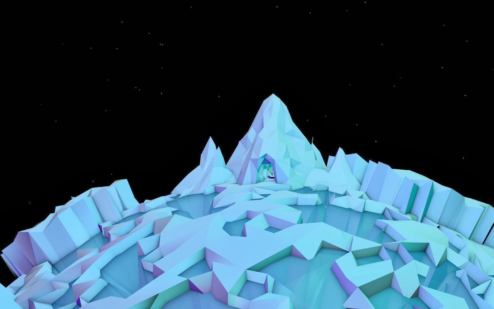
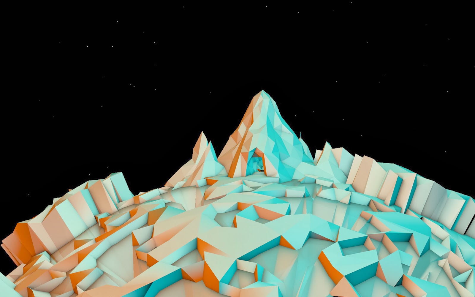
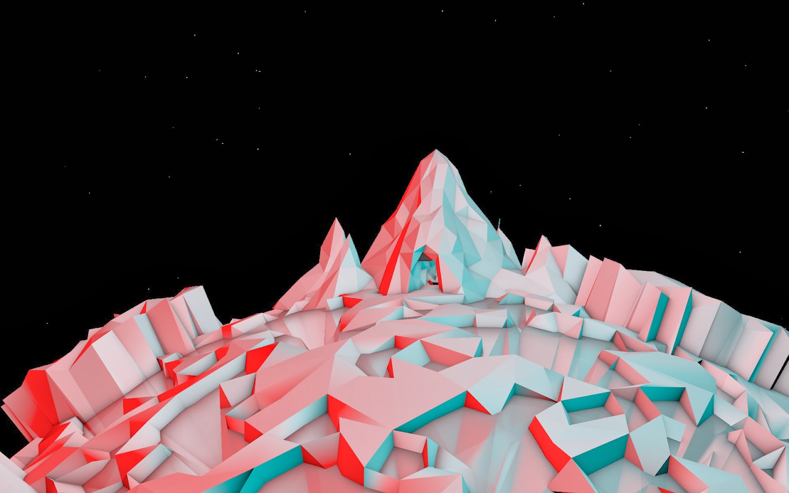
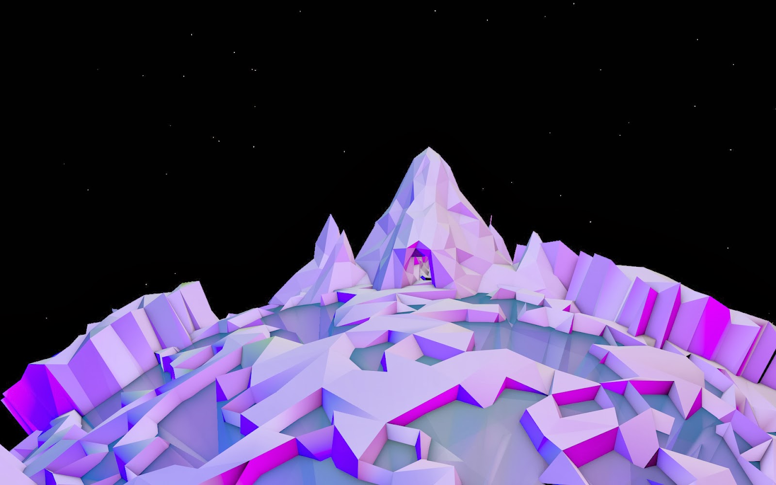
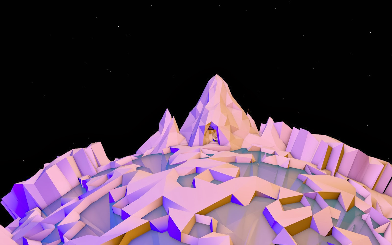
Final Environment Stage 3 V1
The third stage of the environmental flythrough is an Ice planet visible as a light representing hope from far away, as the camera gets closer it becomes clear that its a cold fractured landscape, jagged and sharp, with very contrasting light sources to represent the contrast between seeing things how you want to and seeing things how they are, these light sources could aslo possibly shift to create the idea of a shifting viewpoint, thinking one thing and then suddenly thinking another.
Like the other pieces I started by modelling and mapping the main model in maya, and then texturing and sculpting it in mudbox, I then alter this and refine the scene within Cinema 4D.


Like the other pieces I started by modelling and mapping the main model in maya, and then texturing and sculpting it in mudbox, I then alter this and refine the scene within Cinema 4D.
Final Environment Stage 2 V1
The second stage of my flythrough will simply be clouds with a geometric sky, this section represents freedom but also boredom, although everything seems better its still all very monotonous, and samey. during this scene a light will shine through and the camera will travel towards this light that represents hope. because the scene is quite simple I played about with lighting and the cloud material for quite a long time to get it looking nice.


In the videos below I was trying to think of ways to demonstrate things not being quite how they seemed, and the world becoming more empty or distorted.
In the videos below I was trying to think of ways to demonstrate things not being quite how they seemed, and the world becoming more empty or distorted.
Subscribe to:
Posts (Atom)