Wednesday, 27 November 2013

inspirations 3

I'm a bit late with posting my recent inspirations so this will be quite a big one, recent games that I have been looking at are Journey, fez, and antichamber.

'Journey' is a beautiful game, the environment is relatively low poly and nicely stylised, the textures are quite simple, but the composition of each scene is fairly close to perfect from the positioning of 3d models and the colour schemes chosen and finally the use of level design to best show off environments, the lighting changes in every level and is always excellent conveying new feelings in the player, this is complimented by the changing music that always seems to capture the mood extremely well.


'Fez' has a really interesting visual style, it is almost completely unique in that it combines a 2D platformer with a 3D world allowing the player to jump to very far away objects very easily depending on his perspective, in this sense it is an excellent game it did something very different and combined the two styles very well although the character is 2d he feels very much part of that world, the 3d models are for the most part quite blocky, simple and modular, but have a certain stylised look that is completed by the wonderful variation of textures. although fez is very good and very interesting but as soon as the player has traversed the first few worlds it starts to get alittle confusing and level designs start to look less and less original.


'Antichamber' brings puzzle games to a new level, and is incredibly fun and rewarding, yet has a very simple visual style, similar in a way to 'portal' but with much less detail, again the game is largely formed from blocks with the exceptions of some modular pieces linked to puzzles and some very abstract shapes to create a more interesting player environment. the colours only exist in the form of light, force fields, and coloured blocks that they player can fire, everything else is white with a black outline, there are a few more detailed pieces like the players gun and certain puzzles but detail is not important when maintaining a minimilast, clean visual style, and the lights do more than enough to direct the player and colour the environment.


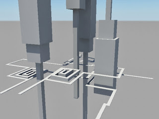
I have also started to become interested in deconstructivism as an architectural movement because of the non-rectangular abstract shapes that are reminiscent of faceted 3D or rather faceted 3D is reminiscent of deconstructivism, this also led me to looking at deconstructionism in art, I have only started exploring this subject area but I feel it could be very relevant.


Terrapeople.ru. 2013. Untitled. [online] Available at: http://terrapeople.ru/terrapedia/wp-content/uploads/2013/02/6.jpeg [Accessed: 27 Nov 2013].


Photobucket. 2013. miloe88's image. [online] Available at: http://i581.photobucket.com/albums/ss254/miloe88/Malaysia-Singapore/IMG_9032.jpg [Accessed: 27 Nov 2013].


Michaeljamescasey.com. 2013. Untitled. [online] Available at: http://michaeljamescasey.com/blog/wp-content/uploads/2011/07/zaha1.jpg [Accessed: 27 Nov 2013].


Monday, 25 November 2013

Under the Sea

I started combining the techniques I learned from the abstract 3d tutorial and the low poly tutorial to create an under sea environment from a thumbnail I used this as an opurtunity to explore different shaders lighting techniques and fog in cinema 4d, here are renders of the progression.


Unfortuneately as I was finalising the piece windows unexpectedly updated and closed everything so I lost quite a lot of work and will remake the scene and improve upon itat another time but for now im abit disheartened, (to remind myself: I fixed the issues with the darkness between the sea and the land and also added some more pillars and a domed building on the left, futher improvements could be seaweed, and light shafts.)

I have been working on my research proposal alot lately narrowing down my research methodology along with my aims and objectives I will post them very soon once they are completely clear.

Thursday, 21 November 2013

Learning Cinema 4D

I downloaded a student version of Maxon Cinema 4D on monday based on Alex's recommendation, the program was very easy to use and after watching the basics video I was able to see were most of the tools where and how to move around the scene and move objects in the scene, I then played about with some shaders to swee if it was much easier than it is in maya and it is, all you have to do is create the shader and play around with it and Cinema 4D will make it look pretty here is the first scene were I was trying out some basic shaders and material attributes.

I then started looking into some tutorials on cinema 4D, the first one I looked at was a really basic look at creating low poly mountains, using a landscape mesh, a displacer and a poly reducer.

http://www.youtube.com/watch?v=82gQUi_PJCs

the second tutorial looked at ways of making abstract low poly shapes, it showed me how to use the connect tool, symetery, gradient materials, ambient occlusion (which is much easier to do than it is in Maya), and shows how to properly organise your scene.

http://vimeo.com/54563392

the resulting work after doing the tutorials is shown below.

mountain tutorial


Abstract Low poly tutorial


The following images are those of experiments I carried out using similar tools and experimenting with others.

made using two symetry tools and rotate
made using an array on the above image

 created using an atom array on three spheres
 same image with poly reduction
 same image with an extra sphere with different shaders
 same image as previous one with displacement on the outer layers


made using two spheres one of which i added an explode to

made using extrude, bevel, and extrude inner
 same sphere as above with an added twist


Cinema 4D is a fantastic program, very easy to learn and above all is alot of fun. I look forward to posting up more work soon. my next practical objective is going to be to recreate a surrealist painting in low poly in Cinema 4D.


Tuesday, 19 November 2013

New Research Proposal Outline


•   What is the proposed research about?
3d environment design specifically focused on low poly and faceted 3d to develop a visual style based on trends in design and optimisation for games.
•   What is it trying to find out or achieve?
How trends in design affect 3d art, and what types of design are most effective currently, and how through this knowledge design can be improved
•   What is the body of relevant literature?
books and journals on Level Design, Design, trends in design, 3d art, player experience, game design.
•   How does the literature support your arguments?
based on what is already known about design and the trends within it I will be able to establish an argument for minimalist design and faceted 3d being just as effective as high poly realistic models.
•   How will you undertake your research?
I will do level tests, media tests, case studies (probably on low poly games), research the relevant literature, research art, and continue to address gaps in my skill set as I go
•   What methods, materials and tools will you use?
Maya, Cinema 4D, UDK, Photoshop, Mudbox will all be used to design levels from concept through to a game level.
•   What are the expected outcomes and benefits?
a final game level that can be iterated on until a polished product is achieved, this will create a strong portfolio piece and will enhance my skills as a 3d artist and level designer.

Friday, 15 November 2013

Crit Review

My Crit presentation went quite well I think and I got alot of useful feedback, Brian (Robinson) seemed happy with the route I was taking and pointed out that cubism started as an abstraction of landscape which could be useful for my research and further experiments, Lynn (Parker) also recommended two games I should look at 'Fez' and 'That Dragon, Cancer' which both include quite stylized low poly models, Fez, journey, and proteus will be the games that I analyse using my critical framework.

Lynn also suggested I look at other artists and experiment with recreating 3D art in their styles, my friend Alex (Grahame) also suggested I get a student copy of cinema 4D because its really good for creating faceted 3d environments. I am now much more confident with the direction of my project.

Wednesday, 13 November 2013

Low Poly Mountain Texture test


I decided to texture the low poly mountain model to experiment with how different texturing techniques may look, I began by mapping the model and then painting the texture in mudbox.


I then rendered this version and combined the smooth shading, and non smooth shading renders.


This seemed abit flat so I added a bump map using a photoshop normal map filter, normally I would sculpt the normals using mudbox but due to the low polys of this model it was difficult to create detail without subdividing which would change the shape of the model.


This didnt look great but the shading was more interesting, unfortunately my painted texture seems to have left some streaky marks but I will be aware to avoid painting it in such a way in future. I then experimented with a few other bump maps already existent in maya.

granite

 noise

 fractal

Finally I mixed a couple of the renders together to make a final render, It can still be much improved but it's given me a better idea of what works visually and what doesn't, I think that normal maps can work with low poly models but it is best when they are simple, and I believe alot of the appeal in low poly shapes is that the edges are very obvious and bump maps can detract from that if not created correctly.


Tuesday, 12 November 2013

Cubism Experiment

I wanted to try something that somewhat encapsulated cubist ideals and i thought an interesting way to achieve that in 3d is to have the same cubes reflected from lots of different angles.

I created a triangulated plane that I deformed and then applied a highly reflective material to (blinn full reflectivity), I then created 3 different sizes of boxes and coloured them individually, then duplicated the boxes to cover the whole scene. I then took renders of the reflective plane and played about with the blinn's material attributes.


Sunday, 10 November 2013

Quick test

here is a low poly city tree sort of thing I made based off a sketch I did


Saturday, 9 November 2013

Inspirations 2

A game that has proved that games can be simplistic but still deeply entertaining is proteus recommended by Lynn, I had seen articles about this game previously in edge but it really needs audio and moving visuals to be effective and I will really need to play it to fully understand it, this is one of three games I will be looking at for a critical framework study.


Lynn also recommended ro.me which is a google chrome experiment that is a mixed media interactive video that uses low poly models excellent animation and audio to create a really beautiful piece of work and leaves the player to explore a low poly world filled with cube art from anyone who wishes to add to the piece, the simplistic models in this are really nicely designed and animated and really inspiring for my work, I also like the idea of a visual experience that the player is constantly moving through and only has to change the direction they are looking.

www.ro.me


New Direction

After meeting with Lynn (Parker) my project has changed to now focus more on developing a stylised aesthetic using low poly models, it may still incorporate level design, and possibly even virtual reality but right now it has been set aside. Lynn talked about the idea of cubism in 3D and what cubist's originally tried to achieve was to see an object from lots of different angles at once, this is a very interesting concept in 3D because in an environment where you can walk around the objects how can you see them from more angles than there are but perhaps through experimentation and attempting to at least somewhat achieve this goal I can develop my 3D visual style as well as work further in areas of 3D that I don't know as well as the modelling side of things.

Lynn provided a lot of useful examples of work that I'm going to list in my weekly inspirations post coming up next.

Friday, 8 November 2013

Low Poly Mountain Test

I wanted to try and work on my low poly design so I created a mountain out of a cube that I smoothed and then triangulated on maya. I took two renders of the mountain one with smooth shading turned on and another with smooth shading turned off, finally I combined them on photoshop using an overlay and reducing the opacity to 70% the results are shown below.

 without smooth shading turned on.

  with smooth shading turned on.

 smooth shading image as background with the no smooth shading image as the overlay.

no smooth shading image as background with the smooth shading image as the overlay.

The last picture is getting closer to the sort of aesthetic I want to be able to achieve though it might further be improved by a simple texture, more lights, ambient occlusion, or a shader which I will further explore in coming weeks, I would also like to look into achieving this aesthetic in a game engine like UDK.

Tuesday, 5 November 2013

Developing My Critical Framework

 knowing that my subject area will be focused around level design I developed a critical framework, the book that helped me most when creating this framework was "Game Level Design" it is a work in progress and subject to change but this diagram should help me to analyse games and determine what is good and bad about them and what combinations of the criteria work well together.


Although I said I would review a journal article for my next theory objective I felt this was more important to get atleast a first draft done early so instead my next theory objective is to write a review of a journal (probably on immersion or player experience).

abstract environment test

Initially I started trying to model optical illusions in 3D and it may be possible but only with shaders and no field of view, and either way they arent that well suited to 3D game environments where they player can walk around, I may explore this further but unless I'm definitely going down an abstract 3D route there doesn't seem to be much point.

So I moved on to create an abstract 3D trying to create an Escher sort of feel, unfortuneately this turned out quite badly quite early due to poor composition, lack of context, and no real goal in mind for the level.

after seeing all the low poly games that are being made recently I had a look into low poly art, it had interested me before in previous projects but I had never looked into it beyond a few artists, some fantastic low poly art can be found on this webpage:

http://www.pinterest.com/justinclaypool/low-poly-3d-art/

This inspired me to create some assets in the most simplistic way by using the same shape over and over again, the first piece I created was a building made of one cube duplicated and re-scaled as shown below


due to this looking quite nice in a simplistic way I moved onto my next test which was mountains made entirely out of one pyramid that I duplicated and re-scaled in the same way.

I found this to be an interesting way to work, because of the speed in which designs can be mocked up and how easy it is to pick up where detail is lacking, I found it similar to adjusting tonal values in a painting by looking at it grayscaled or while squinting.

I then started to create some slightly more detailed assets but still trying to stay as low poly as possible and use simple shapes, below is a tree and some rocks.


By now I felt I had enough pieces to create a small environment so I attempted to make a low poly landscape with two cars on a road.

 
when I was happy with the rough composition I started adding more of the assets I had already created to make a mock up scene.

Its incredible how much easier it is to manipulate a scene and get the composition the way you want it when working with low poly models, it also allowed me to focus more on some of my weak points (e.g. making good use of outliner). I then moved onto colouring the environment, toying with the lighting and adding little details like clouds (made entirely out of spheres).


and finally I went into photoshop to make a few minor adjustments and create the final image.


This style of 3D is ideal for mocking up levels because of the speed at which assets can be produced, altogether this piece probably took around 7 hours and if I were to create another one I'm certain I could do it much faster. As for the low poly style I do really like it and think there is a trend recently leaning towards it, in the same way architecture has slowly trended from highly detailed buildings to simpler designs that look cleaner, minimalist and more modern. I'm not sure if I will pursue this style yet but its a possibility.

My next practical objective is to create a higher poly 3D piece by using someone elses artwork.