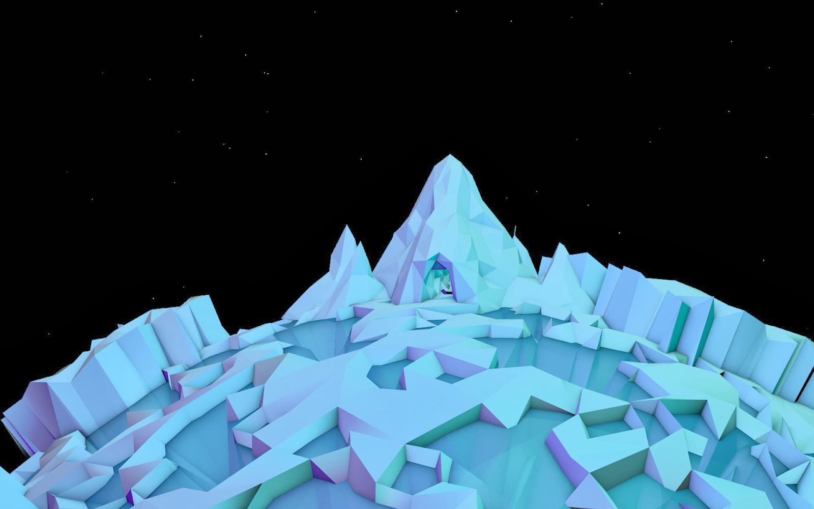
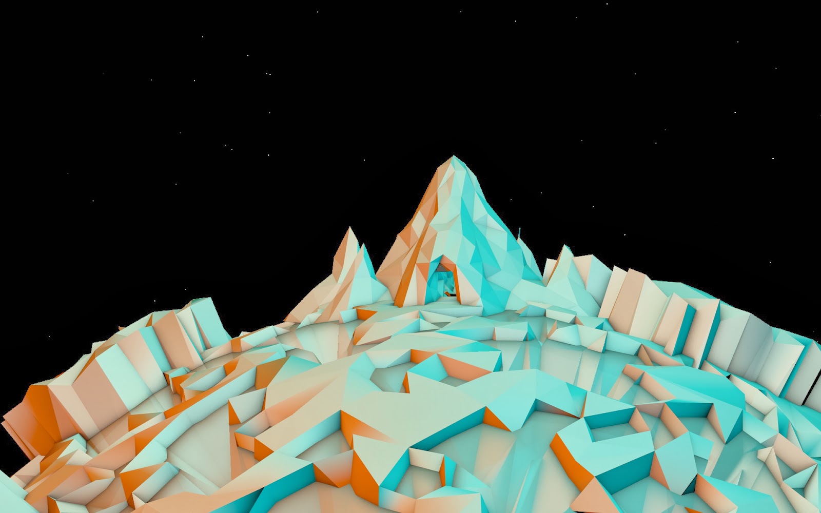
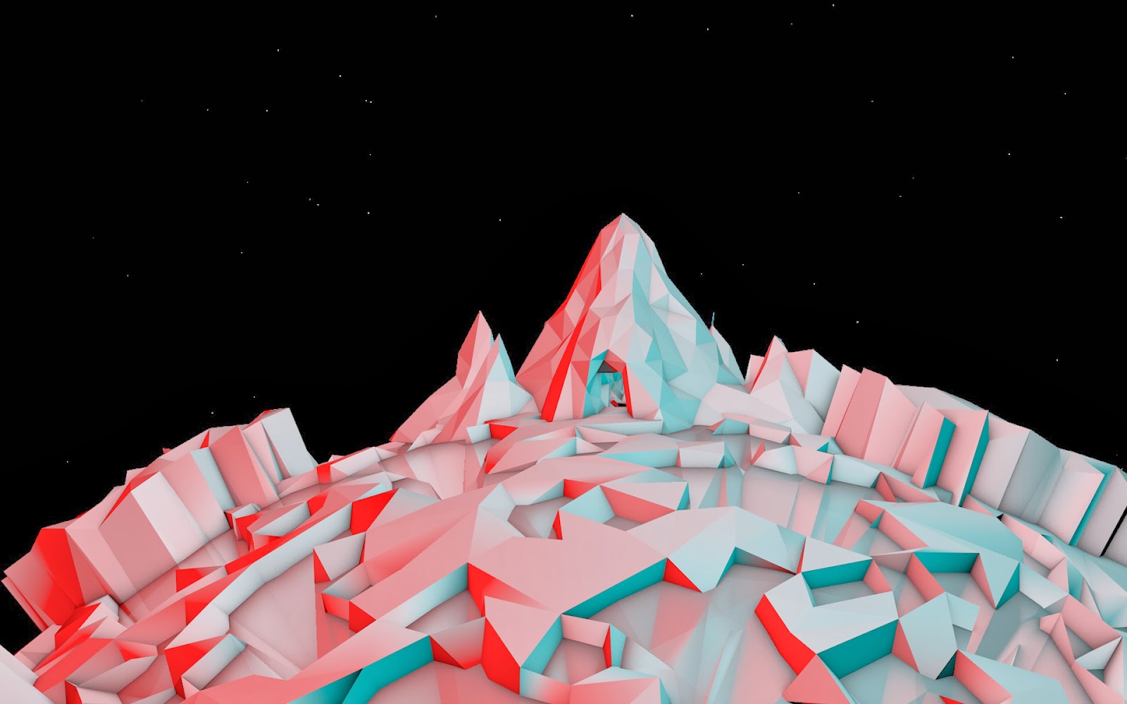
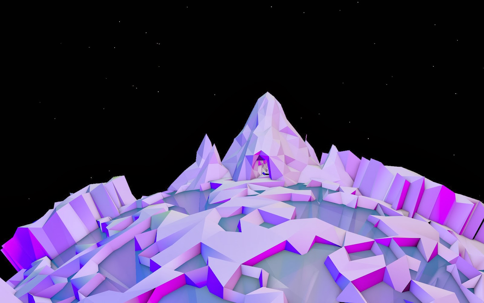
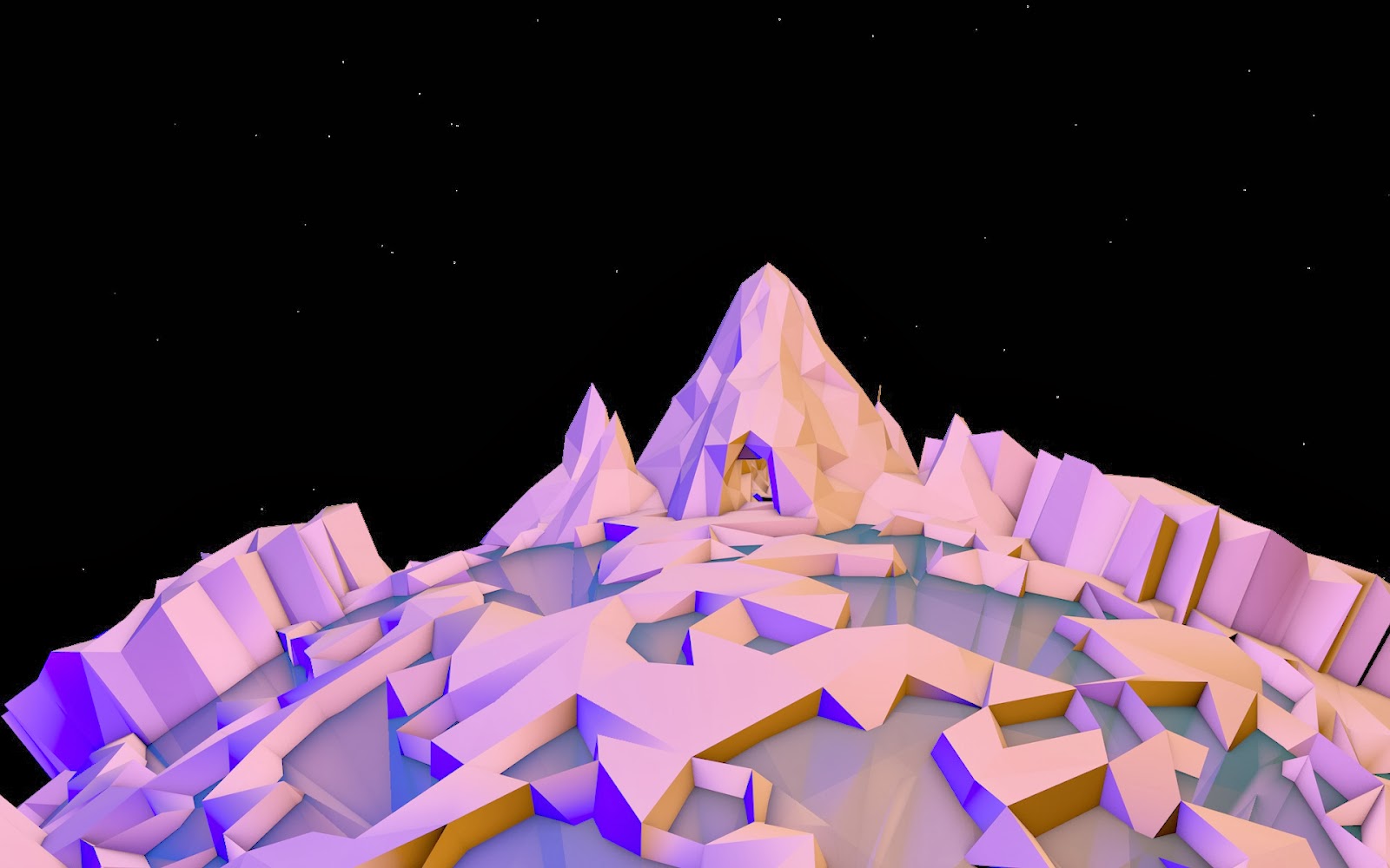
 Over the last week I have been doing quite a few experiments with light, initially I did tests with colours to see both how much a colour could change a scene but also to see how the way light defined the forms differently. These tests weren't overly successful although they did show variation the lights positions and intensities largely stayed the same, meaning the way it defined the form was largely the same.
So after Lynn suggested I did higher contrast images that focus more on the form I started thinking less about colour and more about position and intensity, aswell as thinking about aspects of chiaroscuro.
Chiaroscuro is an italian
term that literally means “light-dark” exploring the bold tonal
contrast that makes pictures more 3 dimensional and create a mood, it was a technique
used by some of the best renaissance painters such as Leonardo de
Vinci and Caravaggio among others, Leonardo used the technique to
paint pictures with more depth and to create a sense of
three-dimensionality that did not previously exist, although these
aspects also apply to Caravaggio's work he used light to create drama
in the scenes depicted, ever since the
contrast between light and dark has played an important role in many
different art forms, architects design buildings to look particularly
good when the light hits them a certain way, even some early cubist
works such as “Seated Nude” by Picasso painted in 1910, although
part of the idea behind cubism was to give equal consideration to
every part of the picture creating a unified surface, this painting
actually focused on the central subject rather than the scene as a
whole, the nude has a strong contrast of light and dark and is one of
the few cubist works to create a “mood” within the picture.
"Seated Nude" - Picasso, 1910
Here are the experiments in which I changed the positions, intensities and quantities of lights.
firstly I created the scene with 1 light, I then quickly messed about with the phong angle but determined that the 0º angle was the best suited for showing tonal contrast for a simplistic scene.
phong angle 80º
phong angle 20º
I then lit the piece from above with a high intensity light this created a quite happy clear environment nothing hidden fully lit. not much tonal contrast though so wasn't very visually appealing.
In this test the light has been moved slightly further away and creates some tonal contrast but not much.
In this test the light is moved much further back in order to create a strong tonal contrast creating some drama within the scene and making it more visually appealing.
In this test I added another light in the foreground and lowered its intensity, this created more variation in the tonal contrast but weakened the strength of it, though I do quite like the lighting in this piece and the way it defines the form.
In this piece I lowered the intensity of both lights creating a darker scene that portrays a slightly morbid feeling.
This piece is the same but with different positioning.
This piece is the same as the one above but with a lower intensity.
This piece is lit by 3 different lights at varying intensities but the whole piece seems fairly flat.
Here is a short render of a light moving across the scene showing how much difference the positioning can make and how it changes the feeling of the scene, it would be interesting to test if the act of the light moving itself can be evocative.


12.jpg)
No comments:
Post a Comment