Thursday, 30 January 2014

Final Environment Stage 1 V1

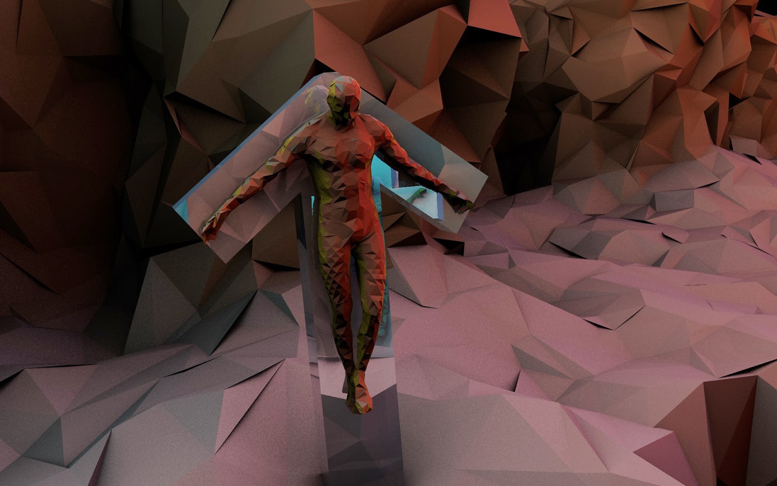
Here is the process behind the creation of the canyon environment of my final piece

1. Maya: I modelled the environment using a plane on maya that I created a crack in then split the piece into two meshes, I then added more edge loops and smoothed the piece, then mapped each side.


2. Mudbox: I then sculpted the piece on mudbox and painted it.


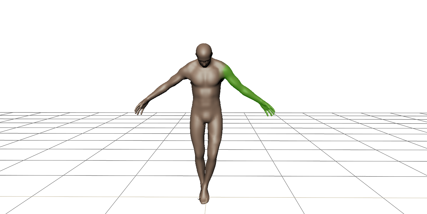
I also created and posed some human meshes using the tools within mudbox


 3. Cinema 4D: I then took all the pieces into Cinema 4D to composite them in order to see what it would look like before putting it into engine. the progression should be fairly self explanatory


 The two figures side by side, male and female on appropriate crosses


 The progression through the canyon depicts a couple breaking apart over time twisting and turning away from each other with the crack expanding as the viewer proceeds.


Here I demonstrate how easily the level of detail can be changed with connect, which will create variation within the final piece.


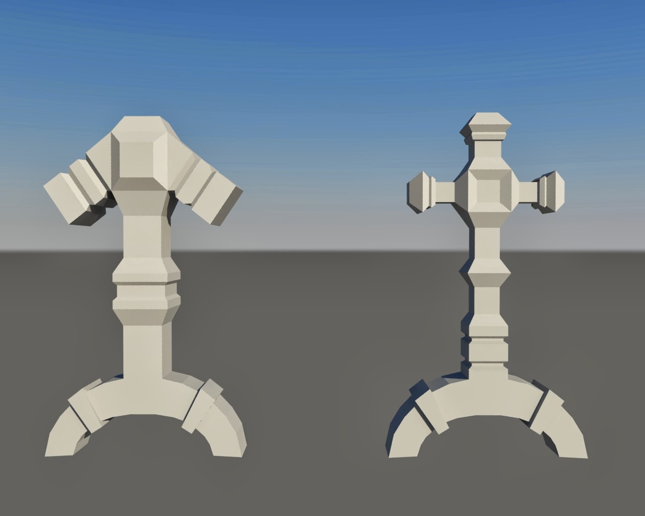
 After talking to some people about the piece one thing that came up was that the crosses didn't look very good so I played about with materials on them.


I then tried extracting a normal map from the mudbox file and applying it to the piece but it didn't make much of a difference possibly because the mesh I originally exported into the piece was the high level sculpt, I have seen alot of this style with paper like normal maps this could definitely be something worth exploring I also have som rock textures I'm going to try.
no normal map

normal map


Here is a short flythrough preview to show roughly how the style looks when animated. Personally I'm actually quite happy with it and it seems it has the potential to be quite evocative.
 

Here is the same flythrough slightly more detailed and with an animated horizontal field of view to create a sort of distortion that could perhaps increase the feeling of constriction.

Below is the render of what the scene looks like at this moment in time.


 Here are the new crosses I modelled in order to hopefully be less blunt through the imagery but still use symbolism.

Global Game Jam

Last weekend I took part in the Global Game Jam event at Abertay University, my team and I created a game in around 44 hours, I was the modeller, technical artist, and animator, unfortuneately because our game Idea was quite ambitious it ended up not being nearly as polished as I would have liked but I gained alot of valuable experience including UV mapping more effectively and I also learnt how to bake ambient occlusion maps on Maya. Our game is available at the link below and is best when played with an X-box controller.
https://dl.dropboxusercontent.com/u/113151635/Global%20Game%20Jam%202014/1.0.html

Controls (Keyboard / Xbox Controller):
-WASD / Left analog stick to move
-Space Bar / A to blink (short teleport)
-ctrl, left mouse click / X to attack (projectile while moving, AOE while standing still)
-V / B to switch between the past and the present

Enemies only spawn in the present but you can not progress far in the past

Monday, 27 January 2014

Third Supervisor Meeting

At my third supervisor meeting with Ken Fee I brought up somethings I was worried about to do with my case study and critical framework. Whether I should still be looking into games or looking more at animation. Ken told me that it should be informed by what my project is and what the final piece being produced is. To fully understand what my framework and case studies should be I need to identify the more subtle aspects of my question, then I can determine exactly what my framework is, Ken also said it was fine to compare games through case studies aslong as it makes sense why I would compare them and how they relate to the project.

One of the agreed upon action points was to interview two more 3D artists, through these further interviews I should be able to further identify the faceted 3D style, I should also ask questions to do with when would the artist use faceted 3D and when would they use realistic 3D in order to gain a wider spectrum on their work and how they feel about it as well as where they think the style is best suited.

I will also be working on the base environments for my final piece this week and I will be uploading my schedule very soon which hopefully I will be able to stick to

Friday, 24 January 2014

Inspiration: Timothy J Reynolds

Timothy J reynolds is a huge inspiration on my work and is really the first person that I saw using this extremely well lit faceted style, the first piece I saw was over a year ago now and I remember it standing out amongst other 3D art I was looking at.


This low poly mammoth piece was so full of character yet is portrayed in a simplistic way, but I also remember seeing things that I thought "that's not right, that's not the way I was taught to model" but at the same time it didn't matter because its visually engaging and it looks like the animal its supposed to.


Lighting and ambient Occlusion are both very important throughout Tim's work this is especially evident in these pieces above.


here are a few other of my favourite pieces, what seems to make a lot of Tim's pieces very effective is the way everything is made out of simply geometry including the sky and water, this creates a certain visual continuity that brings the scene together.

Below is a short interview with Timothy J Reynolds were I asked him some key questions about the art style. 


1. What do you think makes the faceted low poly style visually appealing for you?  
I think I like the idea of interpreting natural, organic content into sharp, faceted edges. I’ve always loved math so I feel like it could have something to do with that. More geometrical = numbers [in my head]

2. Did you ever establish a link between any of your work and an art movement like cubism or structuralism, were retro games more of an influence, or did other 3D artists inspire you?
No, not that I know of. I failed art history, probably because I never really showed up much or tried but got along ok in my art classes. :) I do love looking back at retro games that had no choice but to use lower polygon counts and getting inspiration from there sometimes. Especially video game level designs.
3. From my point of view it seems composition, lighting and materials are all very important for creating a good scene, but is there anything that you would spend more time on when creating a scene in the faceted low poly style?
I think that’s about it. Lighting might be the most important and overlooked with most artists. I spend a lot of time there and takes a ton of trial and error, usually lighting any given scene 2-3 different times before I’m happy.

4. The low poly models you create seem to be effective for games, magazines and illustration, do you think that faceted low poly environments could also be effective in animation?
Yes, I’ve seen more and more animations in the style. I should really learn how to animate.. I’m obviously behind in that department and would love to make more stuff “move.” Making a game is also high on the list but waiting to find the right partner. 

5. Do you feel that stylised 3D can be equally or more effective than realistic 3D, if so why?
I tend to prefer any 3D that is not realistic. I just think that realistic 3D can be so.. boring. It’s a weird thing to me, to know someone spent 100+ hours making/modeling/lighting/etc a perfect living room when the end result just looks like a photograph. Call me crazy, but I think that’s boring. It takes amazing skill and I can be impressed by it, but again, just not something I seek to ever do as it doesn’t excite me.

Reynolds, T. J. 2008. Turnislefthome.com | The Work of Timothy J. Reynolds. [online] Available at: http://www.turnislefthome.com/ [Accessed: 24 Jan 2014].

Thursday, 23 January 2014

Animatic Version 1


This is my first Animatic for my cinematic piece, I created it using simple geometry in Maya, the camera follows a curve through the environment in a similar way to the way it will in the final piece but the camera path is likely to change a lot as are the lengths of time in each environment. I then put it all together on Adobe Premiere with the music of "And So I Watch You From Afar: The Voiceless" again this may not be the definite song chosen but hopefully it partially shows what I envision.


Monday, 20 January 2014

Faceted Worlds: Colour Tests

Because my environments will vary quite abit and the a certain mood should be evoked I have been doing colour and lighting tests in Cinema 4D to test what sort of colour schemes work best within certain environments.

 normal planet similar to earth

Lava planet

 Desert Planet 1

Desert Planet 2

Ice Planet 1

Ice Planet 2

Rain forest Planet 1

Spooky Planet 1

Some of these will be updated if I have time but I'd rather focus on producing the actual environments now that I feel ready to do so. Below are som renders I did for fun along the way just thought I'd add them anyway even though they aren't really that relevant I just made them when I was distracted and thought they looked nice.


Desert and crystal environments

Here are some of the 3D environment tests that I have done and not yet posted though they are relatively old now.

The first desert piece was to test how well smoothed objects and faceted objects would work together, although it looks ok in the end I think I prefer having the entire scene faceted for visual conginuity.


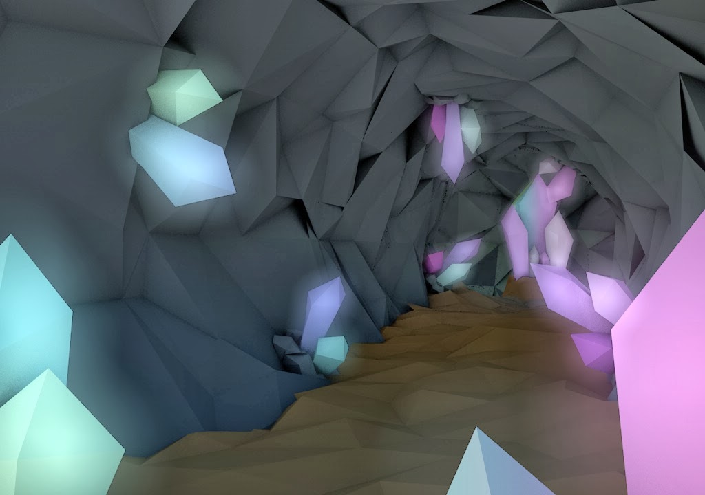
The second Crystal Cave piece was too look at how glow effects could be used within faceted 3D environments, although it looks okay in this piece I now know that there aren't many points that I will actually need it in the final piece and if I was going to do it I'd need to make the model glow in UDK, the test was useful however for using the connect and dubplicating models to create variation and make new shapes very easily in the faceted style, the rocks around the crystals for example are all made up of spheres duplicated and connected I have found this is to be a useful modelling practice within the aesthetic style.


Below are some tests I did importing these two scenes into UDK, this was done before the Pipeline test and highlighted what some of the major issues could be, issues to do with normals, and models importing correctly which I have discussed previously in the pipeline test.