Hell
I used a boolean to cut a landscape out of a cube
I then created several mountains that had a 360 degree bend so they went round in a tube to give interesting effects.
I then duplicated the mountains and rotated them and moved them further back
I added a blueish and red light, I liked the dark blue on the rocks but not so much the red.
I changed the redlight to a volumetric orange light I felt this worked quite well.
I added a black spiky orb I'd modelled to act like a sort of pupil and changed the blue light into a volumetric one and added a pretty intense glow to the background, I do like this render but it wasn't right for the scene.
I was quite happy with the lighting in this scene and decided to continue working on other elements in the scene
I tested a fresnel displacer on the orb as in my experience this can create quite interesting effects when combined with complex geometric objects.
I then applied a gradient displacer to the orb and changed how it was mapped to get a more randomised dispersed effect.
I then added another lower intensity volumetric blue light, and added a camera, I then animated the camera and the eye.
Here is the video of the animated environment. which should loop once composited in the showreel animation.
Heaven
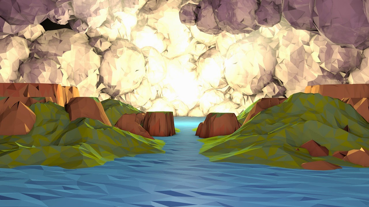
Initially I tried to make a beautiful natural fertile looking landscape.
I then added clouds and some lights but quickly realised the materials and lighting would need alot of work. I created the clouds by duplicating spherical landscapes under a connect and rotating and scaling them.
I thought one large light in the center would be quite effective, I tried some variations of fog textures of the clouds but was not happy with the effect.
I duplicated the clouds and added another pinkish light in the foreground to lighten the scene making it seem less sinister.
I finally got a material I liked on the clouds, just a slightly transparent matte material.
I then filled up alot of the gaps with clouds, and added visible spotlights to try and create a more heavenly light.
a close up of clouds, I think I was testing the visibility of a spotlight.
I decided I liked the water better as space.
I then tried out a highly reflective surface.
and then settled on something inbetween. I then started animating the clouds and lights and it is currently rendering a preview.
here are some renders I messed about with in photoshop.
here are some renders I messed about with in photoshop.


No comments:
Post a Comment