Sunday, 11 May 2014

Final Animation

Here I will explain some of the processes involved in actually making my final animation, followed by the animation itself at the end of the post. Firstly I will say that the prep work is not included in this post and it is more about the progression of render tests and animation choices, to see how the environments were made simply look further back in the blog. The biggest challenge for creating the animation was making it flow in the way I wanted, which was for the eye to lead straight to the canyon, which lead to the clouds, which lead to the ice planet, and so on.

There are two problems with this, the first is that the files ended up quite large and hard to manage, the second is the render times are completely ridiculous. To deal with the first problem animation files were kept seperate except for the canyon to ice cave scene which had to be part of the same animation to blend correctly. To deal with the second problem rather than rendering the animations out to AVI files they were rendered as PNG sequences, this allowed for faster render times with no consequence if the computer turned itself off or something like that, it can also useful for compositing to have stills of the first and last frame of each animation.

Because the canyon and ice cave scene were both seperate I had to merge the files, I then set up a new camera, and started re-arranging all the keyframes that were already in each scene. I then thought about the feedback I had recieved in focus groups and started creating test renders. Here is the first below.


In this render I had simply put the pieces together, and roughly created the transition between environments, the cubes were for cloud placement because at this point I hadn't merged them with that file. I also tested the changing of the background colour in order to try an change the mood of the scene but this only really became effective at changing the mood when the colour of the lights were also changed along with the sky. The shattering of the sky although it wasn't what I had originally envisioned was the best way I could think of that would also represent that world shattering after the mountain is broken. The main problem with this scene was the brightness, altough it doesn't have ambient occlusion on but the ice planet was meant to get much darker as the camera approaches.


In the above scene the main changes are the clouds were added and the lights and materials of some objects has much smoother animation that was much closer to what I had envisioned. The clouds turning dark before they explode was interesting because it was actually just the way the material was picking up the area light from the canyon but I quite liked it so left it in. The clouds are supposed to become less interesting and then dissipate so them turning a greyer darker colour does make them seem less appealing and then they explode. If I had time I would have liked to make the whole cloud scene longer maybe have the camera fly through clouds for about 20 seconds, but unfortuneately I didn't have the best time management nearing the end and was only able to render what I felt was a priority, including re-renders of all the other scenes.

Below is the final Animation although I will be working on a longer version in order to create a music video but hopefully the piece demonstrates how light, colour, movement and form all communicate emotion in experimental animation. Although the piece has undergone many changes, and the project as a whole was a fairly bumpy road, I am happy with the final piece, as stupid as it sounds I feel that it is one of the purest things I have ever created and is very close to what I had envisioned. If I had more time I would have liked to add more synaesthesic elements that would visualise the music, I would have also liked for some of the scenes longer, but as it stands I think the amount of time it takes is well suited for the degree show as people won't want to stand in the one place for five minutes watching my animation.


Thursday, 1 May 2014

Quick Look at some other experimental animations

Erään hyönteisen tuho (The Death of an Insect)

First thoughts: The most striking quality about this short film is the movement, although the detail in the models and the huge variation of lighting adds greatly to the piece but the movement is what creates this sort of pure beauty from what many people would consider to be disgusting things, the film seems to relate the insects and their movements to aspects of human life, to begin with it seemed like despair, falling and things falling apart, it then started to turn to destruction and as soon as the light to dark horizon shows up and the sun moves rapidly to the right the insects begin marching and almost look like they have guns. By the end of the film the insects are incorporated with our real world and have created complex ethereal machines that float above our cities.

The overarching theme seems to be humanities disrespect for all forms of life and our preference to destroy rather than create, much of the piece feels very dramatic, and is lit in such a way that seems to suggest its not about how good we are. Our ability to despair, destroy things, wage war, and create things all come across over the course of the video and all of them take part on a never ending cycle a rhytm of life that is much the same as an insect spiralling towards the ground or the DNA within us as humans.


Hooray For Earth - 'True Loves' (Cereal Spiller Remix) Directed by Cyriak

The most striking thing in this animation is the timing, and through the composition the camera simply zooms in the entire time but speeds up and slows down at certain points, the movement is also largely quite uniform along isometric tangents and its through this compositional clarity that gives the music video its visual appeal


Wednesday, 30 April 2014

Stage 5: Flower City

 This is the final part of the animation it will include a city within a flower and a light that descends into the flower, the flower will then open and the camera will move into the city and towards the light, this represents hope and opportunity, and the city with its tall towers supported by each other is representative of the people within the city that support each other.

Below is some images of the development of the piece and then a preview animation, though the final animation will take place in a similar environment to the heaven one in a post below.

First of all I made some basic cuboids of different sizes and did at least 3 alterations of each and arranged them so that no two were that close together. I then further duplicated and rescaled these buildings and combined them with each other to create further variation.
 
I then imported the buildings into Cinema4D and started texturing them, in hindsight it would have been better to import all the basic pieces into Cinema4D before arranging them into a city so I spent a little bit of extra time replacing untextured buildings with textured ones.

I added the flower to the scene and animated it, then duplicated and rotated and scaled the city a couple of times and created a much denser looking city.


Monday, 14 April 2014

Heaven and Hell

For my new team "squelch animation (wip)" I am creating some work for a showreel but I am also going to use variants of the scenes in my final animation to replace the space element scene which I decided against. Below is a progression of both scenes.

Hell
 I used a boolean to cut a landscape out of a cube

 I then created several mountains that had a 360 degree bend so they went round in a tube to give interesting effects.

 I then duplicated the mountains and rotated them and moved them further back

 I added a blueish and red light, I liked the dark blue on the rocks but not so much the red.

 I changed the redlight to a volumetric orange light I felt this worked quite well.

I added a black spiky orb I'd modelled to act like a sort of pupil and changed the blue light into a volumetric one and added a pretty intense glow to the background, I do like this render but it wasn't right for the scene.

 I was quite happy with the lighting in this scene and decided to continue working on other elements in the scene

I tested a fresnel displacer on the orb as in my experience this can create quite interesting effects when combined with complex geometric objects.

 I then applied a gradient displacer to the orb and changed how it was mapped to get a more randomised dispersed effect.

 I then added another lower intensity volumetric blue light, and added a camera, I then animated the camera and the eye.
Here is the video of the animated environment. which should loop once composited in the showreel animation.


Heaven

 Initially I tried to make a beautiful natural fertile looking landscape.

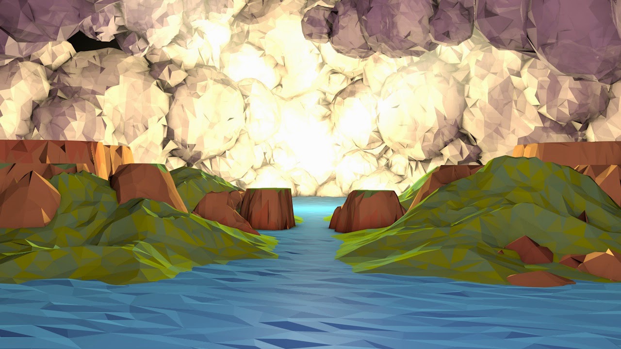
 I then added clouds and some lights but quickly realised the materials and lighting would need alot of work. I created the clouds by duplicating spherical landscapes under a connect and rotating and scaling them.

 I thought one large light in the center would be quite effective, I tried some variations of fog textures of the clouds but was not happy with the effect.

I duplicated the clouds and added another pinkish light in the foreground to lighten the scene making it seem less sinister.

 I finally got a material I liked on the clouds, just a slightly transparent matte material.

 I then filled up alot of the gaps with clouds, and added visible spotlights to try and create a more heavenly light.

 a close up of clouds, I think I was testing the visibility of a spotlight.

 I decided I liked the water better as space.

 I then tried out a highly reflective surface.


and then settled on something inbetween. I then started animating the clouds and lights and it is currently rendering a preview.


here are some renders I messed about with in photoshop.


Thursday, 3 April 2014

The History of Motion Graphics and Definition of Terms

The History of Motion Graphics: From Avante-Garde To Industry in the United States
author: Michael Betancourt

page 11

"Contemporary 'motion graphics' first emerged from experiments with kinetic abstraction in the late nineteenth and early twentieth centuries. The nexus of abstract film's synchronized geometries with live action outside the framework of narrative, the conventions of sychronized sound and image, and finally the development of kinetic typography shows that motion graphics are more than animated graphic designs."

Some of the first motion graphics consisted of abstract films created in 1909 by Futurist painters, these experiments were unfortunately lost, however they did not simply appear they were established from a larger context that produced abstract art generally. The core of the development of motion graphics was and is synaesthesia which is a term used to describe the visualisation of music and is most obviously demonstrarted in commercials, animated logos, and title sequences. "The aesthetic principles that organize and structure the relationship of image to soundtrack, originates with the earliest abstract films, and before them, with color music."

Page 12

"Prior to the 1980s, motion graphics were almost entirely limited to media made by artists. 'Synaesthesia,' as a term for connections between sound and image, is used in both psychology and art history:

   In psychology, where it identifies a specific perceptual phenomena where one sense simultaneously produces two sensations, most famous as seeing colors when one hears sound.

   In art criticism and art history, to define art works where (most often) visual forms are produced as an analogue to music: in synaesthetic abstraction, these connections are explicitly made by the artists in their work."

Page 40

The origins of motion graphics lie within abstract film which provided a foundation for the conventions of how images should interact with sound. By tracing developments of abstract motion pictures during the twentieth century three distinct phases can be identified that mark its place as a genre of animation. The first phase starts with the creation of motion pictures and "ends with Art in Cinema exhibitions organized by Frank Stauffacher at the San Francisco Museum of Art in 1946." This marked the beginning of the second phase characterised by the development and consolidation of organisations that are dedicated to presenting films as an art form, unrelated to Hollywood and commercial cinema. The third phase began in the 1970s with a historical focus, "the abstract film and video were institutionalized by the art world that selected canons of major artists in avant-garde film generally; abstraction based on synaesthetic concerns was relegated to a minor position within this history."

Page 79-82

Oskar Fischinger (1900-1967) is one of the artists most closely associated with motion graphic production, often taking a very direct approach of synchronizing note to form. Fischinger established a connection between sound and abstraction-in-motion after most of a decade spent experimenting with "automating and reducing the labor required to produce animations." One of the pieces that best demonstrates Fischinger's ability to create engaging and communicative pieces with basic shapes and the synchronization of note to form is An Optical Poem (1938), to create this complex series of shapes flying through space he constructed a scaffold and manipulated the shapes with wire. The piece is shown below.


Page 90

Len Lye and a collaborator Laura Riding wrote a paper "Film-making" in 1935 in which "Lye proposes a tentative framework to think about motion as form:

1. Form in movement-compositions is the total effect of accidental design created by cross-movements, perspective movements, timing, accenting - all the varieties of action whether in natural juxtaposition or not.

2. There is a possibility of isolating a movement-consciousness by reverting to such reflex-spontaneities as hereditary instincts are composed of. It might even be said, perhaps, that this gift of physical immediacy, which is the gift of a consciousness of movement, is discoverable through the brain in blood, organs, tissues, nerves: that a physical time-sense can be physiologically cultivated.

3. Consciousness of movement may be purely receptive, as a passive sensing of the vibration-pattern: so we might speak of a sense of movement just as we speak of a sense of telepathy, meaning a receptive intuition of other people's thoughts, or a theosophic sense, meaning a receptive intuition of things unknown."


Defining terms

Experimental Animation

Is typically non character based and does not include narrative but instead creates meaning through visuals and the movement of them, to truly experiment though requires the animator explores the unknown to attempt to create something that has not been done before. Experimental animation also often uses synaethesia in order to give music form.

Non-Objective Animation

Non-objective animation differs from traditional animation because it does not attempt to be representational of life and is more expressive creating forms and the movement associated with them that are purely imaginative.

Non-objective animation is without a doubt the purest and most difficult form of animation. Anyone can learn to 'muybridge' the illusion of representational life, but inventing interesting forms, shapes and colors, creating new, imaginative and expressive motions — 'the absolute creation: the true creation,' (1) as Fischinger termed it — requires the highest mental and spiritual faculties, as well as the most sensitive talents of hand.” William Moritz 1988


Wednesday, 2 April 2014

tenth Supervisor meeting

My tenth supervisor meeting wasn't a particularly long one. I talked about how I'd started reading more about experimental animation and how my first focus group went. The main issue that arose was that I still need to properly define all the terms I am using, which is the highest priority right now and that is why I am still reading at the minute to better define what I mean by the terms I am using, I also need to get my first draft of my dissertation to Ken as soon as possible, this means I will largely be focusing on it this week. I also need to do my other focus group but I want to get my dissertation draft in first because it is worrying me the most and I will need Ken's feedback on it.

Wednesday, 26 March 2014

Ninth supervisor meeting

At the meeting I talked mostly about my question being reworded and what that means, I explained that although the question has been reworded it has been done so in a way that incorporates more of my research than the previous question. Ken expressed once again his concerns that my changing of the question would be detrimental to my grade, but I'm inclined to disagree and continue research under the new question that I feel encompasses more of my research and is more relevant to my final piece and dissertation.

I reported my progress with the focus group hypothesis, and videos as well as my progress with my dissertation so far.

The agreed upon action points were to research more experimental/non-objective animations, which leads to the next action point of defining all the terminology and what it means to me in writing, I also really need to get a draft of the dissertation to him soon as time is running out.